MAT 101 Mathematical Modeling Using the Computer
Predicting the Future and Other Mathematical Magic
Objectives:
- Gain more practice in making charts
- Gain more practice in reading charts
- Learn to use trendlines to predict the future
Using Trendlines
|

www.coyleandsharpe.com/gallery/8.html
|
Trendlines are the mathematician's version
of the crystal ball. They allow us to predict the future with some degree
of accuracy, at least when it comes to numbers. Trendlines can be used
to predict future expenses (for example, term bill prices), business sales,
population growth, climate, or anything else that has a numeric value.
This makes them a very useful tool because they can help us make decisions
about the future. Luckily, Excel can calculate these automatically when
we give it information from the past.
 There are two different ways that trendlines can be generated. The easiest and best way
is by utilizing the "Add Trendline" feature under Chart in the
top menu bar. (This is the method outlined in the text, Matering Excel,
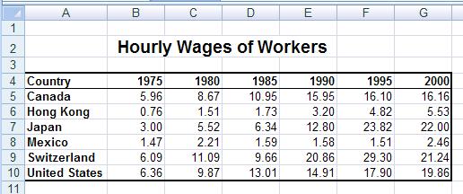
and we will also go through it here with the data given on the right
which represents how much money workers in a variety of countries make
per hour. There are two different ways that trendlines can be generated. The easiest and best way
is by utilizing the "Add Trendline" feature under Chart in the
top menu bar. (This is the method outlined in the text, Matering Excel,
and we will also go through it here with the data given on the right
which represents how much money workers in a variety of countries make
per hour.
|
First of all, you need to highlight all of the data, including
the labels. (In this example, that is A3:G9.) Then from the Insert Tab, choose theChart called XY (Scatter), and making sure Excel correctly identifies that your data is in rows or you need to push the swithch rows and columns:

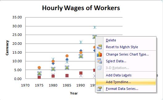
This gets us a nice graph. To add a trendline, you right-click
on a data-point and choose "Add Trendline" and follow the directions in
the wizard.


Note that the linear equations can be used to predict the future in
any year! How well do these equations work for prediction?
That is where R-squared comes in.
R-Squared (aka R2)
R-squared (R2) is always a number between 0 and 1. Here R is formally called the square of the coefficient of correlation
and can range from -1 to 1. R-squared is, of course, the square
of R, which serves to make it non-negative. Suppose that you
have ordered pairs of data (x, y) . The hope is to find a linear
relationship by which the variable x can be used to predict the value
of y. Of course, we don't expect this relationship to be exact, so the
predictions will not be perfect, and R-squared is a measure of how
"good" we expect those predictions to be. When R-squared is close to 1,
the relationship is almost exactly linear and the predictions will be
almost perfect. When R-squared is close to 0, the linear equation we
get does a poor job of predicting y when x is given. R-squared
gives the percent of that variability that is "explained" by x.
Using Auto-Fill Instead of Trendlines
The second, less-flexible, more prone to error, and more difficult
method for predicting the future utilizes the Fill function as we
have already seen in class. When data is entered into Excel, we can
click on the past data and then fill over (or down) to future data.
Warning-- the use
of this method, will lead to errors when the data is not evenly
spaced!
But, if the data is evenly spaced, autoful can also be used to
give you a complete linear projection. We can use the values
it predicted to estimate how much compensation workers will get in 2075
($60.40) or any other year which is a multiple of 5. Note
that using this method, you cannot predict the future in a year that is
not a multiple of 5.

If your independent variable values (as in the examples above)
are all equally spaced, then you can use either method for making future predictions: trendlines OR autofill.
However, if your independent variable values are NOT all equally spaced (eg.
1960, 1970, 1995, 2000), then autofill will not work,
so you will have to use trendlines ot get an accurate model!
This assignment is to be completed individually, but you may consult with one another as long as you give appropriate credit.
This assignment will be dedicated to working more with linear models
that can be found using Excel's trendline feature. Please use
trendlines instead of autofull for all predictions. All of the
data is actual environmental data.. You should be able to copy and
paste the data into the Excel rather than retyping it. Be sure to
convert from years to "number of years after..." to avoid possible
rounding errors.
- CO2 Emissions:
Scientists have linked the warming trend that took off in the twentieth
century to the buildup of carbon dioxide (CO2) and other heat-trapping
gases. By burning fossil fuels like gasoline, fuel-oil, and natural gas,
people
release tons of carbon into the atmosphere each year, and the amounts released
each year have been increasing. To look carefully at this trend, see CO2
Emissions and use the number of years after 1950 to create a trendline.
- CO2 Concentrations:
350 ppm is the number that leading scientists say is the safe upper
limit for carbon dioxide--measured in parts per million in our
atmosphere. Measurements taken in Hawaii show an 18-percent
increase in atmospheric CO2 concentration levels from 1959 to 2002. To look at the numeric trend since 1959, see CO2 Concentrations,
and then create a linear trendline using only the year and the mean (average) columns. From: Dr. Pieter Tans, NOAA/ESRL (www.esrl.noaa.gov/gmd/ccgg/trends/)
- Global Temperatures:
The ten warmest years in the history of the planet have occurred since
1990. To look at the trend, see Global Temperatures,
and use the number of years after 1880 to create a trendline.
- Weather Disasters:
Even before the disasterous hurricanes of 2005, over the last two decades,
floods and other weather-related disasters were
among the factors prompting millions of people to migrate. To look
at the trend, see Weather Disasters and
use the number of years after 1980 and create a trendline.
Create a graph for each of these datasets with each dataset on a separate worksheet
that is appropriately entitled. Then answer the following questions for each
of these four data sets.
- Excel: Find the linear trendline model produced for this data by
the Excel trendline feature that extends to 2010, being sure to include
the linear equation and the R2 on the model.
- Paper: Write the linear equation and the R2
on the model on your paper then use the R2
value to explain whether you believe the model fits the data well.
- Paper: Assuming a linear model and that current trends continue,
find what your mathematical model predicts about the year 2010.
- Paper: Explain the real world interpretation of the slope of your
mathematical model.
Save your file as yourusernameA12.
You must submit the Excel document in the dropbox by the beginning
of class and turn in the paper portion at the beginning of class.
As always, all work done in Excel should be formatted so that it is readable.
Assignments that are unreadable due to poor formatting (either too much or too
little) will recieve a lowered grade.

 There are two different ways that trendlines can be generated. The easiest and best way
is by utilizing the "Add Trendline" feature under Chart in the
top menu bar. (This is the method outlined in the text, Matering Excel,
and we will also go through it here with the data given on the right
which represents how much money workers in a variety of countries make
per hour.

